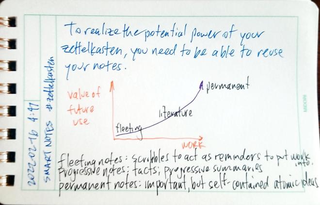
To realize the potential power of your zettelkasten, you need to be able to reuse your notes.
You should also have at least one historian: maybe Ann M. Blair, Richard Yeo, Matthew Daniel Eddy (@BookScribbler), or Markus Krajewski?
Jeremy Dean (@Dr_JDean) and Remi Kalir (@RemiKalir) are intriguing within both the education and technology space.
For a dramatically different perspective from most of both my suggestions and others I’ve seen on the thread, a Sketchnotes representative like Mike Rohde (@RohDesign) would be nice.
The basic zettelkasten note taking method is very simple and clear cut as originally described by Konrad Gessner in Pandectarum sive Partitionum Universalium (Zurich: Christoph Froschauer. Fol. 19-20, 1548) to Sönke Ahrens’s book How to Take Smart Notes: One Simple Technique to Boost Writing, Learning and Thinking – for Students, Academics and Nonfiction Book Writers. Just a handful of bullet points can outline the elegance and simplicity of the system. This dramatic simplicity leads to some tremendous value and complexity.
However, in modern use as seen online since roughly 2018 on, the idea and the digital tools surrounding it, has seen some severe mission creep. Zettlekasten has moved to the fad stage and we’re “zettlecasting” everything under the sun. While it can be used as a productivity tool specifically for writing, some are adapting and using it (and tools built for it) for productivity use writ-large. This includes project management or GTD (Getting Things Done) functions. Some are using it as a wiki, digital garden, or personal knowledge management system for aggregating ideas and cross linking them over time. Others are using it as a journal or diary with scheduling and calendaring functions tacked on. Still others are using it to collect facts and force the system to do spaced repetition. These additional functionalities can be great and even incredibly useful, but they’re going far beyond the purpose-fit functionality of what a zettelkasten system was originally designed to do.
Ahrens highlights the zettelkasten method as being simply and specifically designed to do its particular workflow well—no more, no less. He cleverly analogizes slip boxes to their larger box cousins, the shipping container, and the way that that they revolutionized the shipping industry.
In hindsight, we know why they failed: The ship owners tried to integrate the container into their usual way of working without changing the infrastructure and their routines. They tried to benefit from the obvious simplicity of loading containers onto ships without letting go of what they were used to.
Following this analogy, many people are currently trying to not only revolutionize shipping, but sourcing, manufacturing, distribution, and marketing as well. While this may be interesting and the digital tools might accommodate some of these functions, are they really custom built from start to finish to really excel at these functionalities? Can they really do all of them at once? While some may come close and do well enough, the added complexity and overreach of all these functionalities may be diluting the base power of what the zettelkasten is capable.
People conflate the idea of note taking and the zettelkasten with tools like Obsidian, Logseq, and Roam Research. This is not necessarily a good thing. If they expect it to do everything and it’s not capable of that or well designed to do what they expect, they’re more likely to get confused, frustrated, and eventually give up. I’ve seen it happening more and more.
As an example, in a book club related to Ahrens’ text in which many highly educated and talented people have been using these tools and have even previously read the book, many are still far too confused about what these tools are and the value that can come from them.
For those who are just coming to the idea of a zettelkasten, I recommend you limit yourselves to just that basic functionality. Don’t muddy the waters with other productivity functions, to do lists, journals, diaries, kitchen sinks, or the latest wiz-bang plugin. Don’t throw in buzz words like GTD and MOC. Stick to the simplest script for a few months and focus on finely honing a small handful of questions and ideas each day from your reading to see what happens. Write, link, repeat. Don’t get caught up in the collector’s fallacy by keeping and saving every single fleeting note (thought) you’ve got (or if you must, put them into a folder off to the side). Focus on the core idea.
Once you’ve got that part down and it’s working for you, then consider adding on those other functionalities. Experiment with them; see what works. But don’t be surprised if those other portions aren’t the magic bullet that is going to revolutionize your life. We’re likely to need new tools, functionality, and a system built from start to finish, to make those other things a useful reality.
Featured image: zettelkasten flickr photo by x28x28de shared under a Creative Commons (BY-SA) license


Details:
cc: Ian O’Byrne, Remi Kalir

~ New essay ~
–
• What Hey gets right about note taking
• Why notes need a spatial interface
• The digital equivalent of sticky notes— Julian Lehr (@julianlehr) September 4, 2020
The real question is what additional value and affordances does this pattern allow? Some of the value is in emptying your head (forgetting) as seen in productivity systems like 43 folders or doing Morning Pages. I suspect that rarely are people revising these tidbits at later times to get additional value from them.
Outside of this, systems like Roam Research may make it easier to create a diary like this with the day’s work, but the real value there is not the date/timeline created, but the way that the system treats each block like its own unit of knowledge and allows cross linking them. In this case, the real precursor goes back at least as far as Konrad Gessner’s Pandectarum sive Partitionum Universalium (1548), which provides a classic definition of the zettelkasten format, though this obviously is heavily informed by the earlier traditions of excerpting and annotating found in commonplace books, florilegia, etc. stemming from the ideas of rhetoric from the Greeks and Romans.
In oral cultures, precursors of this sort of time ordering can be seen with respect to the ideas of ancestral time, genealogy, and techniques like the songline in Australia, but the implementations will vary and it’s unlikely that one might find a complete one-to-one mapping of these ideas into Western cultures.
I've been meaning to do some kind of index card style template for the site for ages and never got round to it. Now I have. I’m quite pleased with it. CSS repeating gradient lines and all that. ❧
ᔥ in // pimoore.ca ()
New ideas spurred by reading, potentially for future expansion and refinement.
Questions relating to the the text. What’s missing? What should have been asked or addressed? What biases exist that should be addressed?
Paraphrases and [[progressive summaries]] of articles or portions of articles. Restatements of ideas which may be reused in other contexts.
Basic, usually new, facts highlighted for future use and/or [[spaced repetition]]
Old school sententiae, aphorisms, and quotes for use in the future
Direct communication with others
Reactions, exhortations (Ha!, funny, ROFL, LOL, etc.), reacji, !, ?, ⭐, basic signs of life while reading
Are there any big holes I’m missing based on your experiences?
A few weeks ago I saw Ben Stokes’ post about PaperWebsite.com and my immediate reaction was, “I have to be able to do that!” I’ve long enjoyed writing by hand over typing as the tactile feel of of pen or pencil and paper is such an enjoyable one. I particularly enjoy using a nice fountain pen on high quality paper.
Obviously there was a route to doing a workflow like this as Ben had shown. I just needed to figure out a method with a low enough barrier that I could personally implement for doing this with my own WordPress website.
Not being a serious coder, I immediately began looking for ways I could leverage some of the IndieWeb building blocks my site supports. Micropub seemed like a no-brainer for the posting portion since I’ve got an endpoint using the Micropub WordPress plugin. Certainly not wanting to manually re-type everything once I was finished writing, I needed a way of converting my handwriting to text and then automating a way to plug that into my micropub client.
A short burst of searching revealed that Google Docs could do Optical Character Recognition (OCR) on photos. I pulled out my IFTTT app and found a recipe for taking a photo and saving it to Google Drive. Then I set up another recipe to watch a particular folder in Google Drive and take whatever text appears in new documents and send it to my website using a webhook that uses my Micropub endpoint. The whole thing only took a half hour from idea to a working prototype. In the end it took a tap to open IFTTT on my phone and another tap to take the photo. Then I had to manually open the document to trigger the OCR. Finally, I had to manually open and edit the post before posting.
I had set the micropub client to post as a draft as a default just in case the OCR wasn’t perfect. This was fortunate as the Google photo OCR was so solid that the letters “Dia” of the microscopic text from the word “Diamond” partially visible on my pen cap that was in the photo got pulled into the post.
In the few times I’ve used this workflow so far, I’ve mostly done straight text and syndicated posts to Twitter, Mastodon, and Micro.blog. Perhaps in the future I might set things up to add HTML links, but they’re fairly easy to add at the editing stage.
Since I started my experimentation, a few others in the IndieWeb community have noticed the paperwebsite.com site. Greg McVerry popped up and linked to it as well. He mentioned that he had a digital notebook with OCR capability. This reminded me that I’ve got both a Livescribe Echo pen and a Rocketbook notebook with a Pilot Frixion pen that has an app for uploading digitized images of notebook pages. I hadn’t done OER with Livescribe in ages, so I pulled out the Rocketbook, which is cleverly erasable and thus reusable not to mention being fairly inexpensive. A bit of quick set up allowed me to take a photo of a page which automatically uploads to Google Drive and does its own OCR process. This already dovetails with my prior process, so the whole thing is much smoother. As a result, I’m composing this post in my Rocketbook notebook and will automatically upload and post it to my site as a draft. I’ll probably add some links, a photo or two, and then publish it in a bit.
The Rocketbook notebook has some solid pages with an odd shiny texture and feel, presumably part of the technology that makes it easy to wipe them clean for reuse. The bottom of each page has seven different faint icon images which are meant to allow the app to determine where to send the digital copy of the notes. One can send them via email or to a variety of storage or sharing services. I could imagine having different recipes set up to allow one to publish their notes to different websites based on the icon X-ed out. Given the micropub possibilities, one could also use the icons as a means of differentiating post kinds (for example, indicating that a particular post is a note, an article, or a bookmark). Another alternate idea would be to use the icons as a means of selecting which services to syndicate your content to (for example, the diamond could mean syndicate this post to Micro.blog, the bell could mean Mastodon, and the clover syndicates the post to Twitter).

The overall process is quite elegant and pleasant. The OCR for Rocketbook is reasonably good aside from a few spelling errors which are easy enough to click and fix. I’ll admit that I far prefer using a fountain pen on some Tomoe River paper to using the Rocketbook paper and the Frixion pen, but really, who wouldn’t?
Since I’ve already got most of the infrastructure, I’ve gone the extra mile and set things up so that I can take notes on index cards zettelkasten-style and use a similar set up to post them to my Obsidian vault using similar IFTTT recipes.
For those who want to set this up themselves, I’ve documented the IFTTT/micropub portion before. I’ll post the specific code I’m using below for these who may want it. The nice part is that as long as you have a micropub server for your website platform (there are many CMSs that have native or plugin support) the WordPress portion isn’t a deal breaker for others.
I’m sure, now that there are multiple proofs of concept, some enterprising developer will build a custom micropub client to do all of this work automatically or with a few options built into a clever interface.
I could see pen and paper manufacturers (Moleskin, Leuchtturm, Rocketbook, etc.) creating apps for doing this too. I’d love to see and hear about others trying this out for themselves. Hopefully it can be done with almost no code or some easy cut and paste from my example. Ask if you need help, and I’ll see what I can do to help.
This following will be roughly standard for WordPress endpoints using the plugin, but they can obviously be modified for your platform of choice.
https://example.com/wp-json/micropub/1.0/endpointPOSTapplication/x-www-form-urlencodedaccess_token=PasswordHere&content=<<<{{Body}}>>>&h=entry&category[]=Social%20Stream&post-status=published&visibility=privateWhile doing some of this I did come across some older examples of handwriting to websites. Aside from handwriting typography which I think is usually ugly, I saw some interesting examples from Jeff Bridges[1] [2], gRegor Morrill, and scrolled through some great examples of handwritten and typed Tweets by Alton Brown. In his case, he was simply taking photos of his writing, but it worked! I’ll admit he had some fun and was definitely creative about it. Hopefully Twitter always exists to save the copies for him.
— Alton Brown (@altonbrown) November 20, 2012
— Alton Brown (@altonbrown) December 22, 2012
— Alton Brown (@altonbrown) December 10, 2012
— Alton Brown (@altonbrown) October 10, 2012
In short, I’ve now got another great way to post to my website. I love the great old school tactile user interface of pen and paper. Now I’m glad to have a reason to be able to do more of it in an ever-digitized culture.
Until I start working on cuneiform solutions…
Write On! 🖋
Editor’s note: This post was originally handwritten on Dec 16, 2021 at 20:15.
The first occurrence of the issue is probably documented here: https://github.com/hypothesis/vision/issues/123, by the head of the company.
I suspect it may take a while before such a color feature might be built in, if ever. (Here I’ll note that I don’t work for or speak for the company or any of the other open source developers on the project, but I am one what one would consider a “heavy user”.) If they have the time (I know they’re very busy), perhaps they may chime in with a potential roadmap or other ideas.
While I’m thinking about it, in an academic context for students, colors may be slightly better indicators of different users’ annotations of a particular text as a means of differentiating one annotator from another more subtly, particularly on texts that are extensively marked up.
Just this difference points out what a mixed bag of functionality colored highlights brings from a usability, design, and user interface perspective. While colored highlights is a seemingly “simple” sounding feature in the analog world where a single document is only annotated by one user, mapping it into a digital shared context is a difficult engineering problem to navigate and solve for. What if your color meanings aren’t the same as those of another?, for example.
While colors can be useful for individuals, do they have the same place in a social annotation product?
I already find it difficult to annotate heavily annotated pages that all use the same color, much less a rainbow of others’ colors. (If this is also you, I’ll note that there’s a handy “eye” icon in the annotation drawer that will allow you to turn them on/off.)
While the value of colors may be useful in some contexts, you could potentially use a few other features, functionality, and methods to creatively achieve a similar feature in Hypothes.is for yourself today. Below are a few potential creative “hacks” that some might try.
You could use the tagging system to create specific tags to stand in for your desired colors: As an example, in some systems I might use the following color designators:
Instead of colors in Hypothesis, for example, one could use the tags “words” or “vocabulary”, “reference” or “citation“, “typo“, “quotes“, or “examples” to stand in for these particular “colors” respectively. I sometimes practice some of these which you can find by clicking on the links, though you may note that in practice I use other tags for them.
In some sense, this is what the software would be doing, particularly with regard to search for these after-the-fact. If you wanted a list of all your “citations” for example, you’d have to search for the color for that and be able to find them all, presuming this search functionality existed with such a color feature. This isn’t really much different than simply tagging all those particular highlights with words like “citation” or “reference” in the first place.
You could created different “groups” (private or public) to stand in for the colors you wish you had, thus a “yellow group” could be used for one “color” of highlight and a “green group” for another. ( See Annotating with Groups for more details.)
Switching between groups for annotating isn’t going to be drastically different than a user interface for switching colors of highlighter. The one drawback (or perhaps it’s a feature?) here is that you will only be able to see one “color” at a time.
As ever, with some work, you could self-host the open source software and modify your copy to add this functionality in for yourself.
Some clever hacks in your browser with CSS might also give you your preferred output. I know some users have done custom work to the Hypothes.is UI in the past: eg. https://tomcritchlow.com/2019/02/12/annotations/, see his gist at the bottom of the post.
Another custom solution which may give you ideas can also be found at https://web.hypothes.is/blog/do-it-yourself-anchoring-and-the-evolution-of-the-hypothesis-toolkit/.
Perhaps adding custom classes on the tags or usernames might allow people the ability to target highlights on a page so that one could define custom CSS rules for each highlight using either usernames of tags as well? Of course, just like the “eye icon” described above, I’m sure there are times that people will appreciate the ability to turn these colors on and off. I personally don’t want the clean interface dressed up in Josephs Amazing Technicolor Annotation Dreamcoat.
Are there ideas or potential solutions for color highlights I’ve missed? How about design problems that might be encountered in implementing color-coded highlights in the older single document/single user model being transferred to a multi-user space with infinite scale? Is color the best and most accessible solution? Are there better things that could be done with color in the product?
Feel free to comment below with your ideas or links to examples.
Interested in other Hypothes.is hacks, tips, and ideas? Try browsing my Hypothes.is archive.


