Acquired 5 x 8 (Hunt Manufacturing Co., Lit-Ning Products Division)
8 5/8 x 5 3/4 x 4 1/8" exterior dimensions
putty color
This seemed like a nice way to enter the exciting world of 5 x 8″ index cards. 

A pittance of $5.00 at the local thrift shop also included a full set of Universal Paper Goods Stock No. 58-25 card dividers with both alphabetic and numeral printing.

A set of 1/5 cut tabbed 5 x 8 inch dividers with the UPG logo and the title Universal Paper Goods Stock No. 58-25. The visible tabs are labeled A 1, B 2, C 3, D 4, and E 5 which will allow for both alphabetic filing as well as filing monthly by date.

Replied to Ames Segment Pick by Anthony HereldAnthony Hereld (noctisadversaria.com)
I ordered a segment pick from Bremerton Typewriter Company several weeks ago. The segment is the arched piece near the center of a typewriter where every typebar passes through on its way to the platen. Decades of ink and paper dust can pack into the grooves there. That’s why an old machine can fe...
Anthony,

I’m glad you finally managed to get your own segment pick from Paul at Bremerton Typewriter. They’re really quite lovely and clever. I will say that oddly, since I bought it, none of the typewriters I’ve gotten since are terribly gummed up as badly as a stretch of them I had gotten before and which were the reason I bought the pick in the first place! The luck of the repairman I suppose…

I must also admit that you seem to be another new member of the typosphere I’ve noticed who has Webmentions on your site! Kudos on that.

Best regards,

Chris
1971h3k77/CJA

cc: Tom Fasano, Ted Munk


I went searching at Star Typewriters yesterday for a nice mid-century Adler Universal.

As if he knew I was coming, Helmut had this lovely Royal/Triumph-Adler R 700 sitting right up front on the counter. It’s essentially a Royal-badged version of the Adler Universal 200 which was manufactured under the Litton regime. It’s a solid standard with some nice speed hiding under the hood. Helmut has added some nice touches of what he calls “lipstick” to zhuzh it up.

Frontal view of a Red and cream Royal (Triumph-Adler) R 700 typewriter

Replied to So What’s all this Indieweb and Webmentions stuff? by Ted Munk (typecast.munk.org)

Typewritten message that reads: "AND INTERACTS WITH IT'S ENVIRONMENT* - BUT, it quickly adds up in complexity and file size. Well, alright! Let's us try out this Indieweb and Webmentions thing that's been going around. Hello, Chris & Tom - I'm not sure why your webmentions aren't showing up here, but I did see Tom's on Chris's blog. We'll try this post and see if it works for a specific post..."

Thanks for your reply Ted. I’m putting some text here in the case that your site filters out img tags the way most WordPress comment sections do. Clicking through to my site will provide the photo of the typed response if this is the case. Tom has a snippet of code which may help this if you need it. Once you’ve got some kinks worked out, it’s not half bad… It might require even more intention that sitting down at a typewriter though?!

A typed index card sitting in the keys of a light green Hermes 3000 typewriter. It reads: Ted, Congratulations, your message came through properly. It did get stuck in my moderation queue, though I think I've fixed that for the future. It also appears that your site doesn't like hotlinking photos from external sites, so I had to tweak that as well. Tom, Now for the fun part: Let's test to see if threaded messages via the comments section work properly as well. I've done it in the past with success, so here's hoping... .I suspect that Ted's site may require some tweaking to show photos in comments the way yyou and I have modified things for ours. Here's to the next wave of typewriter technology! Best, Chris

What is the prettiest typewriter typeface?

Typewriten sample of 7 typewriter typefaces  on the same page including an art deco Royal Vogue, a slightly italic, san serif and smaller Professional Elite No. 41, a san serif Hermes Epoca, a serifed Italic Pica No. 31, a blocky serifed Congress Elite No. 84, a crisp, san serif Clarion Gothic, and a computer-esque, san serif Numode No. 61.

I often see typewriter enthusiasts “debating” over which is the prettiest or best typeface, and often, they’re making their judgement on one machine they happen to have or really wish they had. Rarely are these judgements made with multiple typefaces on the same page for easier direct apples-to-apples comparison, so I threw together a small sample from a few in my own collection. 

Gut reaction time: Which of these is your favorite?

Acquired 1959 Olympia SM3 portable typewriter (Olympia-Werke AG)
Serial number: 1477358
Professional Elite No. 41 typeface, 11 pitch, 2.3m/m, 6 lines/inch, bichrome, carriage shift, tabulator
American keyboard, 44 keys, 88 characters
green crinkle paint, black plastic keys
Manufactured in Wilhelmshaven, Germany
Found at The Predecessors while typewriter hunting in Anacortes, WA. It was paired with another similar green Olympia SM3, but I immediately picked this one up because of its beautiful and uncommon typeface. 

It’ll need several new parts including rubber, but this portends to be a fantastic typewriter.

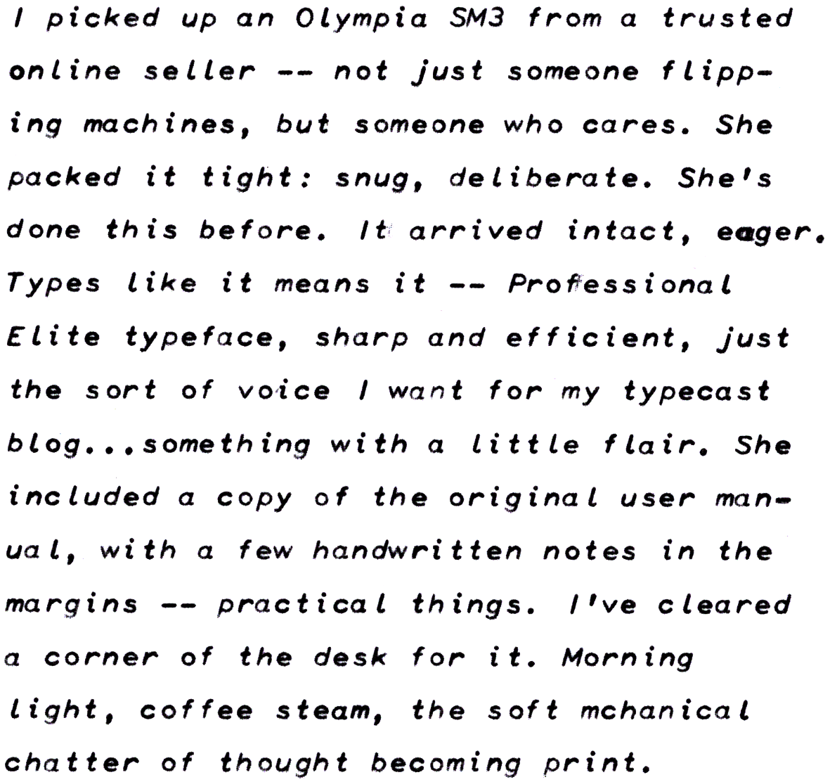
Typed manilla card with sample of a 1959 Olympia SM3 typewriter with a Professional Elite No. 41 typeface which is a small sans serif slightly italic face.

1959 Olympia SM3 portable typewriter in green crinkle paint on an oak library card catalog next to a silver plated cocktail shaker in the shape of a zeppelin.

Acquired Lit-Ning Model 1K Card Index for 2 x 3.5" Cards
Overall dimensions: 3.5 x 4.5 x 8"
I picked up this vintage card index meant for filing business cards on July 20th for a fantastic $1.50.  I hadn’t seen a card index this small before and suspected that it was designed as a sort of Rolodex for storing 2 x 3.5″ standard business cards. It makes an excellent storage for those as well as for the several dozen other old affinity cards and library cards I’ve got. Of course, my problem is that it only fits about half of the business cards I’ve got. 

There are a few places that still make card dividers for this size format, but I opted to make my own from 11 x 17″ card stock.

Acquired A-Z (1-25) Gray Pressboard 1/5 Cut Tab File Guides, Letter Sized (Oxford Pendaflex)
25/Set (PN 925)
I saw these while browsing through a thrift store and correctly clocked them as thick tabbed dividers though the person who rang them up for $1.50 thought they were folders because of their heft. 

I’ve been wanting some for use with 8.5 x 11″ index cards, but thought that most major stationers had quit manufacturing them decades ago. It turns out you can still get them from Tops via a variety of different office supply outlets, though closer to the range of $15-40 per pack. I’m sure these will work wonders in my Shaw-Walker filing cabinet. 

Interestingly, one outlet I saw was pitching them for dividing files within a single a folder, but I’m guessing they weren’t aware of how these were used historically. (The entire group of 25 would fill up a standard manilla folder all by itself!) It’s sort of a shame that they only count up to 25 instead of 31 so that one could also easily use them as a days-of-the-month tickler file. 

Oxford Pendaflex tabbed dividers 1/5 cut showing the letters/numbers on tabs A/1 up to E/5

I’ve been thinking about typewriter stationery and carbon copies lately, as has our friend Joe Van Cleave. Has anyone used or had NCR paper stationery made for themselves?

I tried some half-sheet stationery at the International Printing Museum not long ago and that seemed like a lovely way to write and keep copies of typewritten correspondence. 

Of course recommendations for designers and printers for personal stationery is welcome here too. 

Acquired 1971 Sears Newport Portable Typewriter (Messa Typewriter )
Serial number: 5124993
Sears Model No. 405-5295 (Pica)
carriage shift; bichrome; 3 touch select settings; tabulator; 13" wide carriage; key de-jammer; carriage lock; 44 keys & 88 characters
Manufactured in Portugal
How could I not pick up his avocado beauty at Acts Thrift for $17.36?! A day’s worth of cleaning ought to bring this bad boy up to snuff. I’m most shocked at the fantastic design of its case.

This is a re-branded Messa typewriter manufactured in Portugal with other known re-badgings as the ABC 3001 and the Brother XL-1016. These were made/advertised from 1971 to 1974, but based on the serial numbers in the Typewriter Database, I would suspect mine is from the early side of 1971. (It’s entirely possible they made the entire run in a year and sold them through 1974.) Including this one there are currently only seven exemplars in the database, but many of them are owned by some of the most prolific collectors.   

With my 52nd birthday coming up this may be one of the youngest machines I own, though it’s still a few years older than me. 

And how could you possibly not love the green typebar jam release key? The only thing that could be cooler would be to have versions in harvest yellow, burnt orange, and coppertone brown. I’ll have to get my old Tupperware set out to properly show this off.

Manual available on Richard Polt’s site.

I’ve already fixed/adjusted most of the primary issues and done a little bit of the work to clean this out. I should be able to finish up the rest of it over the long weekend with the exception of one or two screws that I can tell are missing and need replacements.  Portions of the case are going to require some attention as well.

oblique angle onto the front left corner of a Sears Newport typewriter there's a button on the corner of the hood that reads "TOUCH"

Typesample of a pica 1971 Sears Newport typewriter

Close up of about 12 slugs on a Sears Newport faturing what looks like a 95 and the mushed together "AR" stamp of Albert Rodrian of RaRo fame.

Close up of the right side of an avocado Sears Newport typewriter featuring a dark green key next to the @/¢ featuring what appears to be two typebars crossing each other