A few weeks ago I saw Ben Stokes’ post about PaperWebsite.com and my immediate reaction was, “I have to be able to do that!” I’ve long enjoyed writing by hand over typing as the tactile feel of of pen or pencil and paper is such an enjoyable one. I particularly enjoy using a nice fountain pen on high quality paper.
Obviously there was a route to doing a workflow like this as Ben had shown. I just needed to figure out a method with a low enough barrier that I could personally implement for doing this with my own WordPress website.
A Quick Solution
Not being a serious coder, I immediately began looking for ways I could leverage some of the IndieWeb building blocks my site supports. Micropub seemed like a no-brainer for the posting portion since I’ve got an endpoint using the Micropub WordPress plugin. Certainly not wanting to manually re-type everything once I was finished writing, I needed a way of converting my handwriting to text and then automating a way to plug that into my micropub client.
A short burst of searching revealed that Google Docs could do Optical Character Recognition (OCR) on photos. I pulled out my IFTTT app and found a recipe for taking a photo and saving it to Google Drive. Then I set up another recipe to watch a particular folder in Google Drive and take whatever text appears in new documents and send it to my website using a webhook that uses my Micropub endpoint. The whole thing only took a half hour from idea to a working prototype. In the end it took a tap to open IFTTT on my phone and another tap to take the photo. Then I had to manually open the document to trigger the OCR. Finally, I had to manually open and edit the post before posting.
I had set the micropub client to post as a draft as a default just in case the OCR wasn’t perfect. This was fortunate as the Google photo OCR was so solid that the letters “Dia” of the microscopic text from the word “Diamond” partially visible on my pen cap that was in the photo got pulled into the post.
In the few times I’ve used this workflow so far, I’ve mostly done straight text and syndicated posts to Twitter, Mastodon, and Micro.blog. Perhaps in the future I might set things up to add HTML links, but they’re fairly easy to add at the editing stage.
Since I started my experimentation, a few others in the IndieWeb community have noticed the paperwebsite.com site. Greg McVerry popped up and linked to it as well. He mentioned that he had a digital notebook with OCR capability. This reminded me that I’ve got both a Livescribe Echo pen and a Rocketbook notebook with a Pilot Frixion pen that has an app for uploading digitized images of notebook pages. I hadn’t done OER with Livescribe in ages, so I pulled out the Rocketbook, which is cleverly erasable and thus reusable not to mention being fairly inexpensive. A bit of quick set up allowed me to take a photo of a page which automatically uploads to Google Drive and does its own OCR process. This already dovetails with my prior process, so the whole thing is much smoother. As a result, I’m composing this post in my Rocketbook notebook and will automatically upload and post it to my site as a draft. I’ll probably add some links, a photo or two, and then publish it in a bit.
Rocketbook Interface
The Rocketbook notebook has some solid pages with an odd shiny texture and feel, presumably part of the technology that makes it easy to wipe them clean for reuse. The bottom of each page has seven different faint icon images which are meant to allow the app to determine where to send the digital copy of the notes. One can send them via email or to a variety of storage or sharing services. I could imagine having different recipes set up to allow one to publish their notes to different websites based on the icon X-ed out. Given the micropub possibilities, one could also use the icons as a means of differentiating post kinds (for example, indicating that a particular post is a note, an article, or a bookmark). Another alternate idea would be to use the icons as a means of selecting which services to syndicate your content to (for example, the diamond could mean syndicate this post to Micro.blog, the bell could mean Mastodon, and the clover syndicates the post to Twitter).
The overall process is quite elegant and pleasant. The OCR for Rocketbook is reasonably good aside from a few spelling errors which are easy enough to click and fix. I’ll admit that I far prefer using a fountain pen on some Tomoe River paper to using the Rocketbook paper and the Frixion pen, but really, who wouldn’t?
Handwritten notes for your digital zettelkasten or personal wiki
Since I’ve already got most of the infrastructure, I’ve gone the extra mile and set things up so that I can take notes on index cards zettelkasten-style and use a similar set up to post them to my Obsidian vault using similar IFTTT recipes.
I’m sure, now that there are multiple proofs of concept, some enterprising developer will build a custom micropub client to do all of this work automatically or with a few options built into a clever interface.
I could see pen and paper manufacturers (Moleskin, Leuchtturm, Rocketbook, etc.) creating apps for doing this too. I’d love to see and hear about others trying this out for themselves. Hopefully it can be done with almost no code or some easy cut and paste from my example. Ask if you need help, and I’ll see what I can do to help.
IFTTT Webhook settings
This following will be roughly standard for WordPress endpoints using the plugin, but they can obviously be modified for your platform of choice.
While doing some of this I did come across some older examples of handwriting to websites. Aside from handwriting typography which I think is usually ugly, I saw some interesting examples from Jeff Bridges[1] [2], gRegor Morrill, and scrolled through some great examples of handwritten and typed Tweets by Alton Brown. In his case, he was simply taking photos of his writing, but it worked! I’ll admit he had some fun and was definitely creative about it. Hopefully Twitter always exists to save the copies for him.
In short, I’ve now got another great way to post to my website. I love the great old school tactile user interface of pen and paper. Now I’m glad to have a reason to be able to do more of it in an ever-digitized culture.
Until I start working on cuneiform solutions…
Write On! 🖋
Editor’s note: This post was originally handwritten on Dec 16, 2021 at 20:15.
I suspect it may take a while before such a color feature might be built in, if ever. (Here I’ll note that I don’t work for or speak for the company or any of the other open source developers on the project, but I am one what one would consider a “heavy user”.) If they have the time (I know they’re very busy), perhaps they may chime in with a potential roadmap or other ideas.
Color highlights are a difficult user interface problem
While I’m thinking about it, in an academic context for students, colors may be slightly better indicators of different users’ annotations of a particular text as a means of differentiating one annotator from another more subtly, particularly on texts that are extensively marked up.
Just this difference points out what a mixed bag of functionality colored highlights brings from a usability, design, and user interface perspective. While colored highlights is a seemingly “simple” sounding feature in the analog world where a single document is only annotated by one user, mapping it into a digital shared context is a difficult engineering problem to navigate and solve for. What if your color meanings aren’t the same as those of another?, for example.
While colors can be useful for individuals, do they have the same place in a social annotation product?
I already find it difficult to annotate heavily annotated pages that all use the same color, much less a rainbow of others’ colors. (If this is also you, I’ll note that there’s a handy “eye” icon in the annotation drawer that will allow you to turn them on/off.)
Potential Color Highlight Hacks
While the value of colors may be useful in some contexts, you could potentially use a few other features, functionality, and methods to creatively achieve a similar feature in Hypothes.is for yourself today. Below are a few potential creative “hacks” that some might try.
Use the tagging functionality
You could use the tagging system to create specific tags to stand in for your desired colors: As an example, in some systems I might use the following color designators:
Yellow—general highlights and highlights which don’t fit under another category below
Orange—Vocabulary word; interesting and/or rare word
Green—Reference to read
Blue—Interesting Quote
Gray—Typography Problem
Red—Example to work through
Instead of colors in Hypothesis, for example, one could use the tags “words” or “vocabulary”, “reference” or “citation“, “typo“, “quotes“, or “examples” to stand in for these particular “colors” respectively. I sometimes practice some of these which you can find by clicking on the links, though you may note that in practice I use other tags for them.
In some sense, this is what the software would be doing, particularly with regard to search for these after-the-fact. If you wanted a list of all your “citations” for example, you’d have to search for the color for that and be able to find them all, presuming this search functionality existed with such a color feature. This isn’t really much different than simply tagging all those particular highlights with words like “citation” or “reference” in the first place.
Use the Group Functionality
You could created different “groups” (private or public) to stand in for the colors you wish you had, thus a “yellow group” could be used for one “color” of highlight and a “green group” for another. ( See Annotating with Groups for more details.)
Switching between groups for annotating isn’t going to be drastically different than a user interface for switching colors of highlighter. The one drawback (or perhaps it’s a feature?) here is that you will only be able to see one “color” at a time.
Roll your own solution with open source
As ever, with some work, you could self-host the open source software and modify your copy to add this functionality in for yourself.
Some clever hacks in your browser with CSS might also give you your preferred output. I know some users have done custom work to the Hypothes.is UI in the past: eg. https://tomcritchlow.com/2019/02/12/annotations/, see his gist at the bottom of the post.
Perhaps adding custom classes on the tags or usernames might allow people the ability to target highlights on a page so that one could define custom CSS rules for each highlight using either usernames of tags as well? Of course, just like the “eye icon” described above, I’m sure there are times that people will appreciate the ability to turn these colors on and off. I personally don’t want the clean interface dressed up in Josephs Amazing Technicolor Annotation Dreamcoat.
Other solutions and problems?
Are there ideas or potential solutions for color highlights I’ve missed? How about design problems that might be encountered in implementing color-coded highlights in the older single document/single user model being transferred to a multi-user space with infinite scale? Is color the best and most accessible solution? Are there better things that could be done with color in the product?
Feel free to comment below with your ideas or links to examples.
Interested in other Hypothes.is hacks, tips, and ideas? Try browsing my Hypothes.is archive.
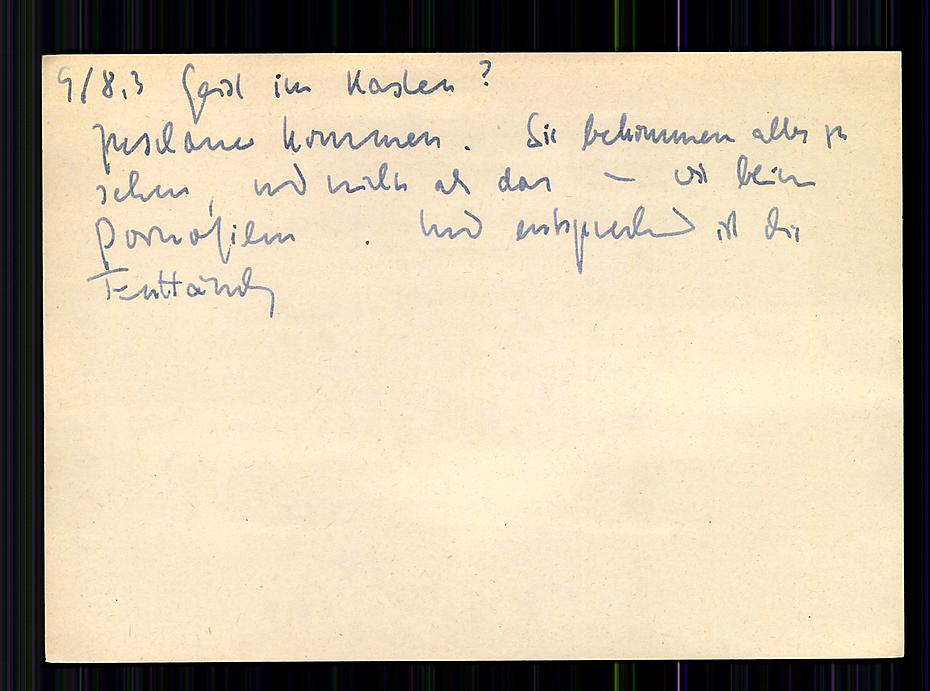
On a slip in his zettelkasten (a card catalog or filing cabinet of personal notes), entitled “Does Spirit hide in the filing cabinet?”, Niklas Luhmann wrote a note about people who came to see his system:
“People come, they see everything and nothing more than that, just like in porn movies; consequently, they leave disappointed.”
This is a telling story about people’s perception of the simplicity of the idea of a slip box (zettelkasten, card catalog, commonplace book or whatever you want to call your note taking system).
It’s also a testament to the fact that the value of a zettelkasten is in the upfront work that is required in making valuable notes and linking them. Many people end up trying out the simple looking system and then wonder why it isn’t working for them. The answer is that they’re not working for it.
Just as sex can be fun, working with a system of notes can be fun. (“Just” can be a problematic word, n’cest pas?) In either framing, both partners need to do some work—neither necessarily the same work. The end result can be magic.
As Potter Stewart might have said, “I may not be able to define proper note taking, but I know it when I see it.”
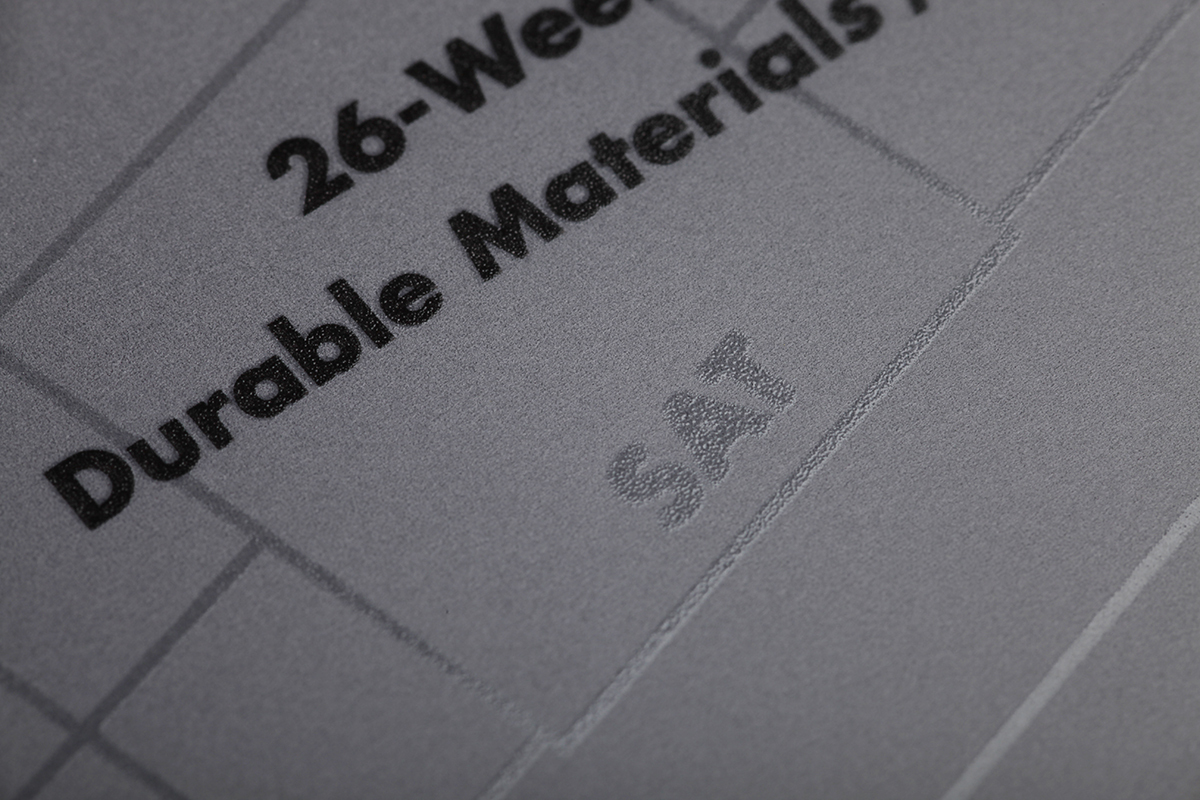
With two planner books and one checklist book, our Ignition Edition 3-Pack for Winter 2021 is the perfect place to keep track of all of your things to do.
4, 3, 2, 1… IGNITION
We all need a place to jot down the first sparks of a big new idea, to record our “notes to self,” and to remind ourselves to pick up the doggo at 4 p.m. on Thursday. Our regular Field Notes Planner is great, but we’re frequently asked for a smaller edition. Our previous limited-edition pocket planners (the long-gone Ambition and Resolution editions) were also great, but we wanted to find a way to fit even more into a Memo-sized date book.
You’ll find that the new Winter 2021 “Ignition” set checks all the boxes. Each 3-Pack contains two 26-Week Planners. Splitting the year into two books gives you a full spread for each week, making more space for each day and incorporating a weekly “To do, or…” list that can be used for productivity OR inspiration. Each page also features a bit of practical advice, direct from Field Notes staff. Note that the pages are undated, allowing you to start either book anytime and fill in the dates as you go.
The third book is a “Checklist Journal” featuring the popular “Screwhead Device” that we introduced in the 2017 “Resolution” Edition. it's great for to-do lists or bullet journaling… or ignore the Screwheads, and use it like any ruled notebook.
The covers are made from water-and-tear-proof synthetic paper from Yupo that will hold up to a whole year’s worth of abuse. The book’s interior page design is subtly varnished over the cover color. The innards are our reliable 60# Finch with gray rules, bound with black staples.
POINTY. SHINY. HANDY.
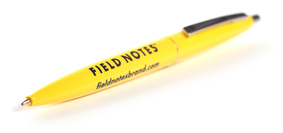
Quarterly Subscribers receive a bunch of bonus items with their order this quarter! Along with your two 3-Packs of “Ignition,” we’re including a carded set of three stainless steel Book Darts. They’re perfect for marking your place as you work through the date books. An “Ignition Yellow” Clic Pen and a two-sided 2022 “One Sheet Calendar” are also included with your subscription shipment. Subscribing is the only way to get these items, and of course you'll get the next three editions, their accompanying bonus items, and a yearlong 10% discount on most items on the website. What’s in store for subscribers for 2022? There’s only one way to find out!
By the way: If you check your planner, you’ll see there are a variety of gift-giving holidays coming up, what would make a better quarterly reminder of your generosity than a year’s worth of Field Notes?
SPECIFICATIONS:
01. Proudly printed by the good people of Lake County Press, Inc., Waukegan, Ill.
02. Cover: Yupo Synthetic 74#C “White,” with a brute force application of “Ignition Gray, Yellow, and Black” soy-based Toyo UV inks and a spot UV varnish.
03. Innards: Finch Paper Opaque Smooth 60#T “Bright White,” with a fine, 1-color application of “Ignition Light Gray” soy-based Toyo ink.
04. Cover and innards printed on a Heidelberg Speedmaster XL 105 40" 6-color UV printing press.
05. Bound with a Heidelberg Stitchmaster ST 270 5-pocket saddle stitcher with cover feeder/scorer and Rima RS 10S in-line stacker, with appreciation to Samuel Slocum, George W. McGill, and William J. Brown, the “Founding Fathers of the Staple.”
06. Corners precisely rounded to a 3/8" (9.5mm) radius with a Challenge DCM double round-corner machine.
07. Edition features two 26-Week Date Books and one 56-Page Checklist Journal.
08. Memo book dimensions are 3-1/2" × 5-1/2" (89mm × 140mm).
09. FIELD NOTES uses only the Futura typeface family (Paul Renner, 1927) in its materials.
10. All FIELD NOTES memo books are printed and manufactured in the U.S.A.
I’ve been thinking it for a while, but have needed to write it down for ages—particularly from my experiences with older manuscripts.
In an age of print-on-demand and reflowing text, why in goodness’ name don’t we have the ability to print almost anything we buy and are going to read in any font size and format we like?
Why couldn’t I have a presentation copy sized version of The Paris Review?
“I could fit this in my pocket,” I thought when the first newly re-designed @parisreview arrived. And sure enough editor Emily Stokes said it’s was made to fit in a “large coat pocket” in the editor’s note. pic.twitter.com/tra25GOk6e
Why shouldn’t I be able to have everything printed on bible-thin pages of paper for savings in thickness?
Why couldn’t my textbooks be printed with massively large margins for writing notes into more easily? Why not interleaved with blank pages? Particularly near the homework problem sections?
Why couldn’t I buy my own hardcover, custom edition of Annotationwith massive five inch margins to really make having a handwritten #AnnoConvo easier? (C’mon MIT Press, I know it’s part of a pre-existing series, but editorial considerations should have necessitated leaving at least an inch!)
Why can’t I have more choice in a range of fonts, book sizes, margin sizes, and covers?
When are publishing platforms going to give us this?!?
I’m reasonably certain that he’s raised the question or issue about the definition of “interlink” or “backlink” before, but it’s come up again today with some discussion and notes which I wanted to capture permanently here with few modifications for myself:
tantek 12:39 PM
doubleloop[m], what’s the difference between “just” a link and an “interlink” from a user perspective?
genuine question (feel free to also answer if you have an idea @chrisaldrich) because Wikipedia seems to consider “interlink” as a common noun to be a synonym for “hyperlink” https://en.wikipedia.org/wiki/Interlink
Chris Aldrich 20:45 PM
I think that the definition for interlinking is expanding based on actual use cases. Historically Tim Berners Lee tried to create hyperlinks as bi-directional and then scrapped the idea as not easily implementable. As a result we’ve all come to expect that links are uni-directional.
In the digital gardens, wiki spaces and now, even with Webmention, there’s an expectation (I would suggest) by a growing number of people that some links in practice will be bi-directional.
If Neil puts a link to something within his own wiki/digital garden, he’s expecting that to be picked up in a space like the Agora and it will interlink his content with that of others.
Many who are practicing POSSE/PESOS are programatically (or manually) placing backlinks between their content and the copies that live on silos creating a round trip set of links that typically hasn’t been seen on the web historically.
Because we’ve mostly grown up with a grammar of single directional links and no expectation of visible reverse links (except perhaps in the spammy framing of SEO linkfarms), the word “interlink” has taken on the connotation seen in Wikipedia. I think that definition is starting to change.
Among a class of users in the note taking/personal knowledge management space (Roam Research, Obsidian, Logseq, TiddlyWiki, et al) most users are expecting tools to automatically interlink (in my definition with the sense of an expected bi-directional link) pages. Further, they’re expecting that if you change the word(s) that appear within a [[wikilink]] that it will globally change all instances of that word/phrase that are so linked within one’s system.
In many of those systems you can also do a manual /redirect the way we do on the IndieWeb wiki, but they expect the system to actively rename their bi-directional links without any additional manual work.
tantek 1:08 PM
ok, the bidirectionality as expectation is interesting
Chris Aldrich 1:08 PM
By analogy, many in the general public have a general sense of what /syndication is within social media, but you (Tantek) and others in the IndieWeb space have created words/phrases/acronyms that specify a “target” and “source” to indicate in which direction the syndication is being done and between sites of differing ownership (POSSE, PESOS, PASTA, PESETAS, POOSNOW,… not to mention a linear philosophical value proposition of which are more valuable to the end user). There is a group of people who are re-claiming a definition of the words “interlink” and perhaps “backlink” to a more logical position based on new capabilities in technology. Perhaps it may be better if they created neologisms for these, but linguistically that isn’t the path being taken as there are words that would seem to have an expandable meaning for what they want. I’d classify it as a semantic change/shift/drift in the words meanings: https://en.wikipedia.org/wiki/Semantic_change
I suspect that if Roam Research, or any of the other apps that have this bi-directionality built in, were to remove it as a feature, they’d loose all of their userbase.
tantek 1:11 PM
yes, such a semantic shift in the meaning of “interlink” seems reasonable, and a useful distinction from the now ubiquitously expected unidirectionality of “hyperlink”
Chris Aldrich 1:12 PM
I’m expecting that sometime within the next year or so that major corporate apps like Evernote and OneNote will make this bi-directional linking a default as well.
tantek 1:12 PM
in sci-fi metaphor terms, one-way vs two-way wormholes (per other uses of “hyper”)
Chris Aldrich 1:14 PM
I can only imagine what a dramatically different version of the web we’d be living in if the idea of Webmention had existed in the early 90s. Particularly as there’s the ability to notify the other end in changes/updates/deletions of a page. Would the word “linkrot” exist in that world?
Joe Crawford 1:22 PM
Or in a world with Xanaduian transclusions, for that matter.
Alas
Chris Aldrich 1:25 PM
Related to this and going into the world of the history of information is the suggestion by Markus Krajewski in “Paper Machines: About Cards & Catalogs, 1548-1929” that early card catalog and index card systems are really an early paper/manual form of a Turing Machine: https://mitpress.mit.edu/books/paper-machines.
One might imagine the extended analogy libraries:books:index cards :: Internet:websites:links with different modes and speeds of transmission.
The Jonathan Edwards Miscellanies Companions are products of JESociety's "Miscellanies Project." Essays were contributed by an international body of scholars hailing from East Asia, Australia, Europe, the UK, and North America. The contributions canvas the wide range of topics contained in Edwards' "Miscellanies."
"The Miscellanies Project" and the Companions are part of the "Visual Edwards Project" created by Robert L. Boss. A unique contribution to Jonathan Edwards studies, "Visual Edwards" is a software project that maps Edwards' writings, volumes 1-26 of the Yale critical edition of The Works of Jonathan Edwards, and provides a new view of America's theologian. "Visual Edwards" is, as it were, an advanced computational material which can be stretched, bent, and zoomed to direct the scholar to areas of interest. As a cartographic tool, it grants the reader visual access to Edwards in his own words.
A team-oriented project to visually unlock Edwards' notebooks, and map intricate connections in his thought, "The Miscellanies Project" and the print Companions are first steps toward the Himalayan task of visualizing Jonathan Edwards -- an ongoing project seemingly without end. To echo Edwards' sentiment in "Types," "there is room for persons to be learning more and more ... to the end of the world without discovering all."
Now available here: https://t.co/zMpGSptDKh DM me or email me at "doctor" plus "my last name" (all one word) at g mail dot you know, and I will send you my chapter in this book as a sample for FREE! https://t.co/SWqmXTP1xs
— Dr. Matthew Everhard (@matt_everhard) Dec 2, 2021
Requesting my copy now…
Ok zettelkasten fans. Unless someone can come up with an earlier source, the inventor of the zettelkasten method for excerpting and note taking is Konrad Gessner in 1548. (Again it’s not Niklas Luhmann!)
More details to come on this fun bit of history soon.
books are a means of listening to the thoughts of others so that you can hear your own thoughts more clearly. ❧
to which I might add:
And annotation helps you save those thoughts, share them with others, and further refine them.
34.1781549-118.1022694
Since I can post to my website by pen and paper with OCR’d photos, I realize I should use a similar workflow to post handwritten zettels to my [[Obsidian]]-based [[zettelkasten]]/[[commonplace book]] too!
thinking of running an experiment where i call someone every time i read 1-3 chapters of something and explain the key ideas to them..very impromptu and spontaneous calls, fairly random readings; do i have any volunteers??
@krishkhubchand Why not (also) scribble them down for your future self and place them in your commonplace book/zettelkasten/notebook/other? If you want to be interactive and get feedback, post them to a website or digital garden…
While he doesn’t mention it, he’s capturing the spirit of the commonplace book and the zettelkasten.
[…] I see my job as basically helping people see and to grab ahold of what’s going on.
You can decide to do that the minute you sit down to start writing or you can just do it all the time. And by the time you get to writing you have a notebook full of stuff that can be used.
And it’s not just about the thing you’re writing about at that moment or the question you’re going to ask that has to do with that week’s event on Face the Nation on Sunday.
If you’ve been collecting all week long and wondering why a thing happens or making an observation about something and using that as a piece of color to explain the political process to somebody, then you’ve been doing your work before you ever sat down to do your work.
I’d love to interview him about his process as well as keeping track of his notes after-the-fact. Does he index them? Collate them? How does he archive them? What role do they play in his book writing processes? Is his system something that he was taught, something which he created and refined over time, or a little bit of both?


 Niklas Luhmann, Zettelkasten II,


